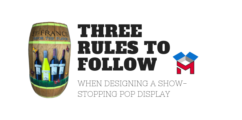
Three rules to follow when designing a SHOW-STOPPING POP DISPLAY

First impressions are powerful. 

Humans are somewhat fickle animals. Most of us have a tendency to quickly judge what we see as being attractive, mundane, or even repulsive.

We can’t help it!

Behavioral scientists tell us that we are subconsciously readily attracted to certain colors over others. And, that our minds process visual information instantly. This means there are subtle, but instant, emotions at play with shoppers as they walk down an aisle and spot a POP display that speaks to them.

For this reason, it’s important that companies design their POP displays with all the bells and whistles necessary to instantly engage, inform, and persuade their target consumer. While that requires some soul searching and creative finesse, our designers at Midwest Graphics can help. With years of experience in designing eye-catching POP displays, we have a pretty good understanding of what works and what doesn’t.

Here’s three basic rules to follow when designing a display:

1. The POP should stop them in their tracks!

 Any POP display must have a WOW factor that makes the busy shopper want to stop and look. It simply must have magnetic appeal. This is where the right signage and design will help set the display apart from the surrounding clutter while adding ambiance to the consumer’s shopping experience.

2. The POP can be LOW COST while ENGAGING.

Making your POP display unique doesn’t necessarily mean it has to be expensive. Midwest Graphics offers many material options at different price points for designing attractive displays. There are many ways to design a great POP at a reasonable cost that will result in a show-stopping, captivating display. As a B2B or B2C designer, we can help you develop a display that will catch your customers’ attention and increase sales while staying within your budget.

3. The POP must SHOUT an impactful story.

Any POP display must draw in the customer quickly. Using branding tenants such as your logo and the right color palette, you should display your product in such a way that it propels buyers to pick it up and examine it. While you may not always have control over where the POP display is placed by a retailer, strive for the gold location of aisle end caps. Impactful displays require smart graphics and copy that simply, but effectively, explain how the product will solve a problem or will satisfy a need of the buyer.

Midwest Graphics in-house designers have years of experience designing custom POP displays.  We handle everything from prototypes and mock-ups to production, assembly, packing and drop-shipments.


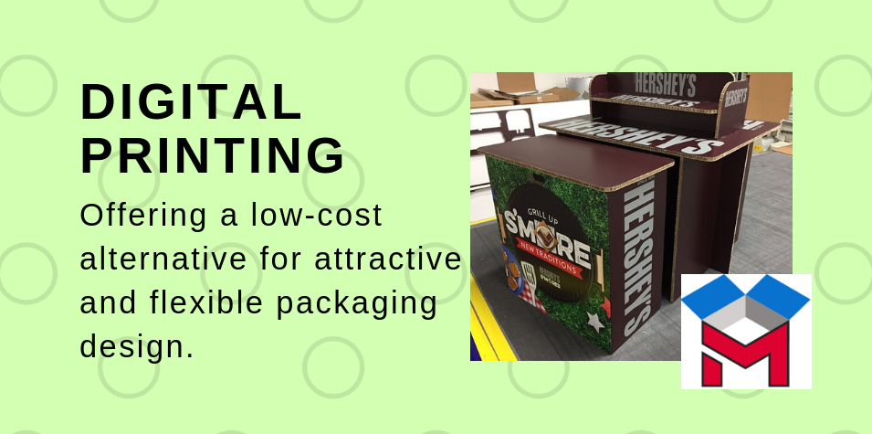
DIGITAL PRINTING – offering a low-cost alternative for attractive and flexible packaging design.

Packaging can play a critical role in establishing a product as a brand differentiator, resulting in something functional, attractive and memorable to the consumer. Such was the experience of Mr. Dog, a purveyor of quality products for dogs. They used digital printing to enhance their packaging and create a comprehensive brand experience in the crowded dog market.

 Mr. Dog wanted consumers to “experience” their brand through distinctive packaging.

The goal of Mr. Dog’s packaging was to give both in-store and online customers a brick-and-mortar experience through unique packaging design. As company founder Matthew Morris explained, “packaging became a primary component of communication – our silent salesmen.

After developing a creative packaging design, Mr. Dog made a regretful decision. In an effort to save on printing costs, they decided to print a single, large run of packages. It was a mistake resulting in 3,000 unused boxes sitting in a warehouse while the business struggled to learn more about its market. The money tied up in the large print run meant less money available for other areas, such as new product research and development.

DIGITAL PRINTING provided the solution needed.

Mr. Dog realized their mistake and turned to digital printing technology for the solution. Instead of pre-purchasing large quantities of packaging to save money, the company began using digital printing for short runs and use the savings to invest in other key areas of product development. This simple change enabled the company to launch new products quicker since the print-production time was shortened.

The company is now using some 20 different made-to-fit packaging systems to accommodate the variety of products offered. There’s been a boost in customer loyalty with a higher percentage of repeat customers than new customers. There’s also been an increase in sales of 60-70% at the retail level.

Midwest Graphics is ready to handle your digital printing needs with no minimum quantities required.

You, too, can enjoy the advantages of using digital printing similar to those encountered by Mr. Dog. Regardless of the size or scope of your project, Midwest Graphics can help bring it to life. From one-off print jobs to lots in the hundreds or thousands, no job is too big or too small.

Whether you have an existing concept or no art at all, our team of designers and computer operators can handle your artistic and structural design requirements. Contact us to start saving on your printing costs today.